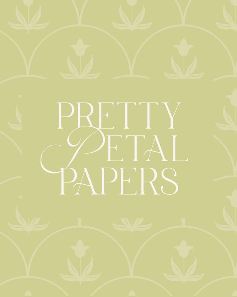
Redesigning Pretty Petal Papers
The same bespoke stationer you know, with a more aligned identity.
We’ve redefined a brand built on joy, watercolor, and the quiet romance of beautiful stationery.
For years, we’ve designed stationery with roots in artful, joyful design. Our work is expressive and personal, you can feel the hand behind every piece. After partnering with clients for several years, we came to the realization that our brand needed to reflect that same quality: timeless, luxurious, romantic, and unmistakably intentional.
So, we decided it was time for Pretty Petal Papers to grow into its next chapter.
This rebrand was never about becoming someone new. It was about becoming more ourselves.
At the center of every decision were two simple words: “Artfully Designed” — two words that became the north star for every decision we made throughout this project.
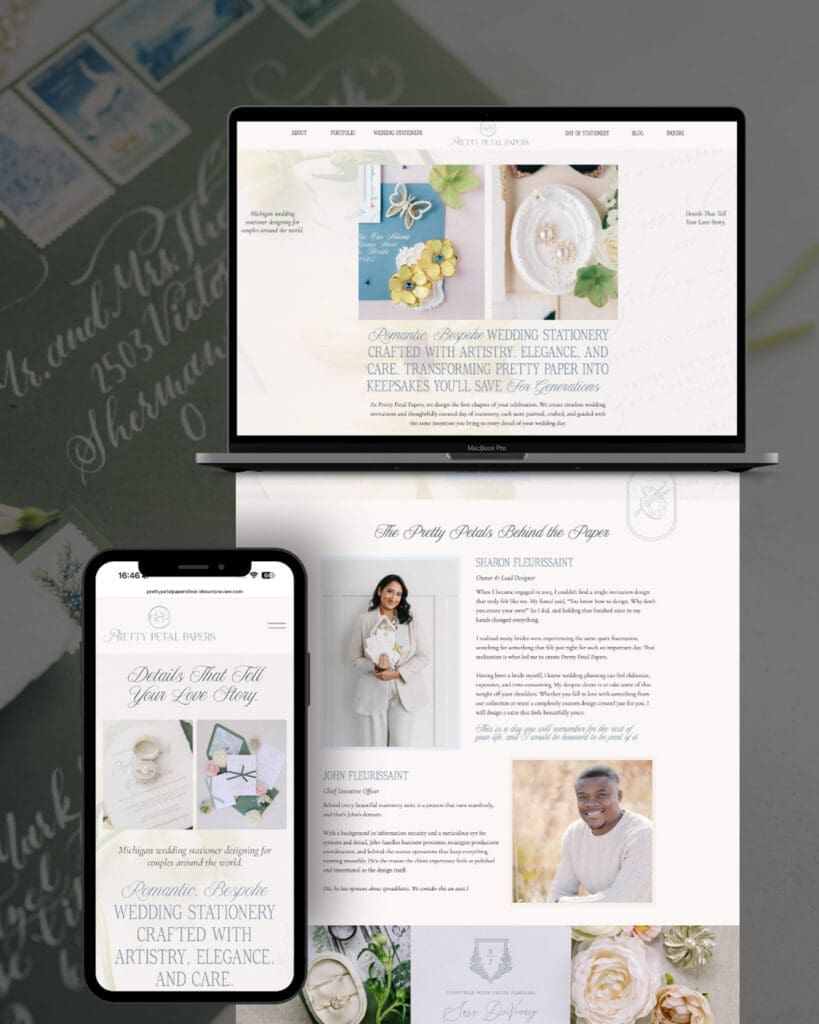
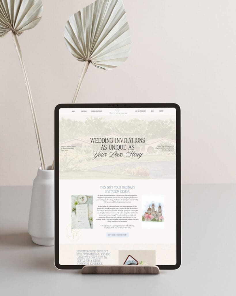
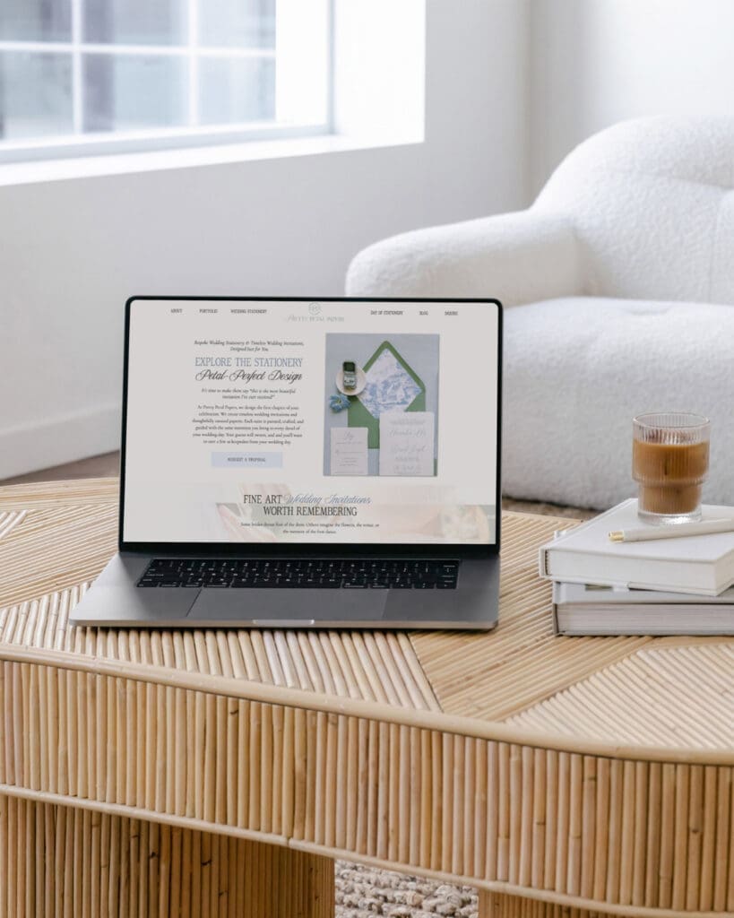
We partnered with Emily Foster Creative to build a custom brand and custom website. Emily’s team helped us shape the strategy, messaging, and aesthetics for the brand, ensuring we didn’t lose track of that north star.
The Brand Archetype — The Lover
We grounded this brand in the Lover archetype. The Lover brand is drawn to beauty, intimacy, and connection. The Lover speaks to people who believe that the thoughtful details in life are what make it meaningful. For a stationery brand whose whole reason for being is helping people express love and care for others, this felt like an unmistakable fit.
The Lover archetype shaped everything from the softness of the color palette, to the romance of the typography, and even to the custom flourishes woven into the logo. Every design decision was filtered through one question — does this feel like something you’d want to hold in your hands?
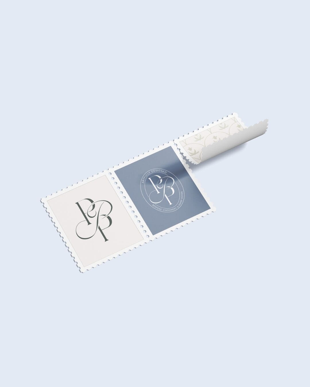
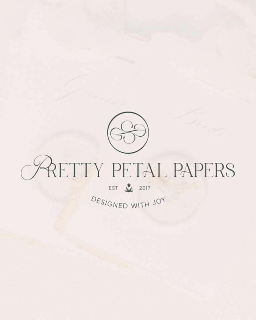
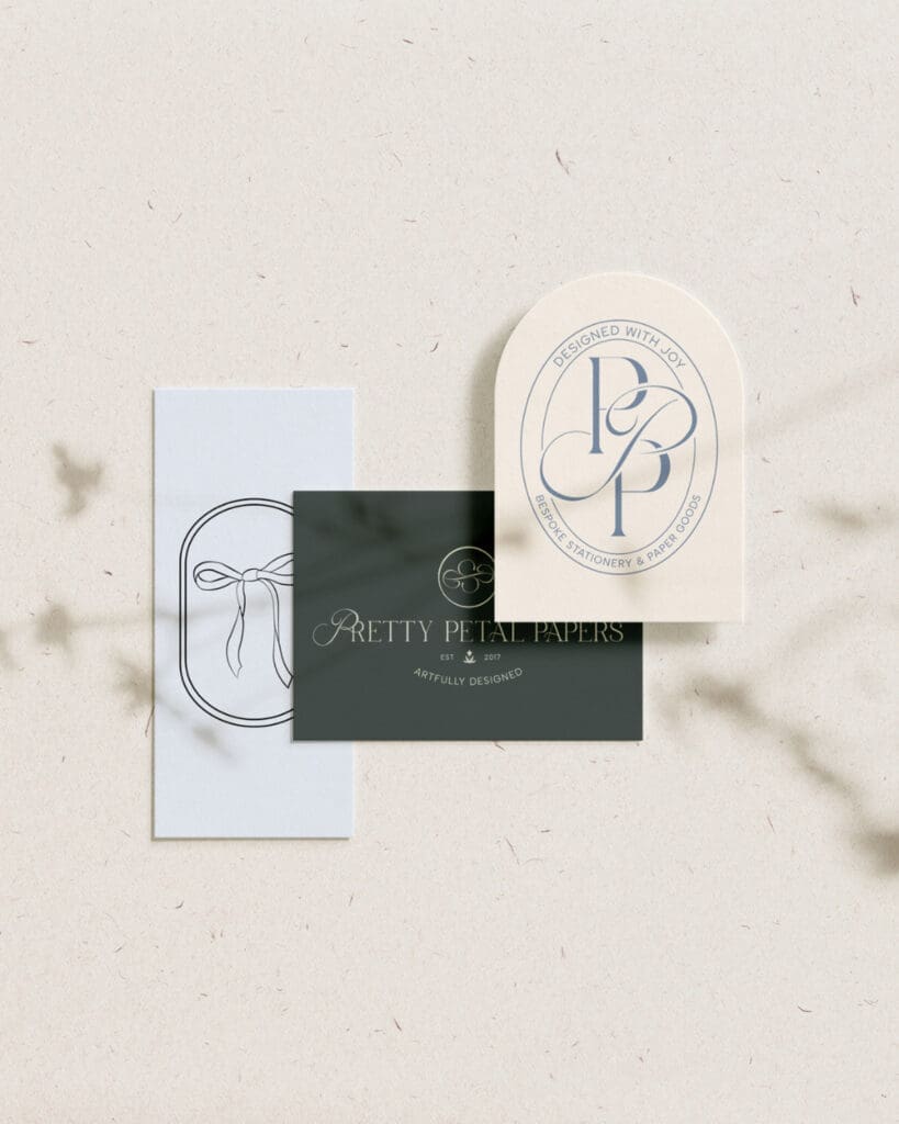
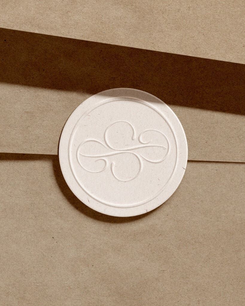
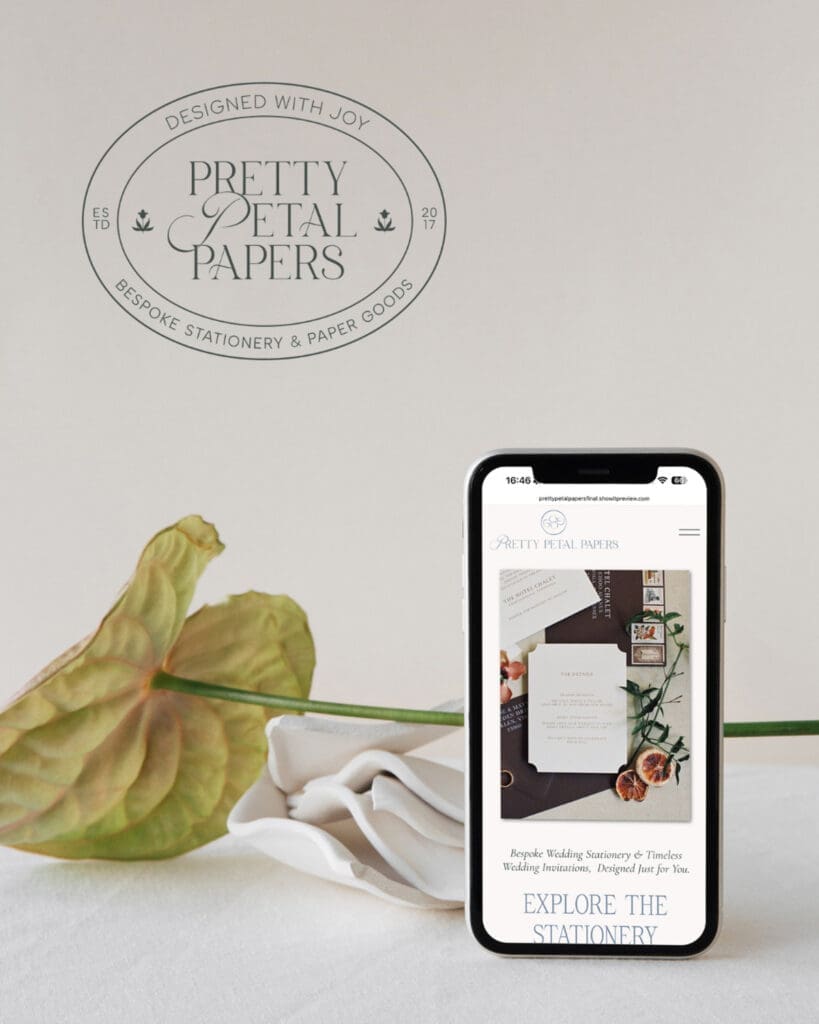
The Brand Asset Suite — Custom, Considered, and Full of Story
Our new logo was designed to feel elegant, artistic, and deeply intentional, much like the stationery we create for our clients.
Every curve and flourish was thoughtfully crafted to feel timeless rather than trendy, romantic without feeling overly ornate, and refined while still maintaining warmth and personality.
We wanted the identity to feel elevated while still preserving the hand-crafted spirit that has always been at the core of Pretty Petal Papers.
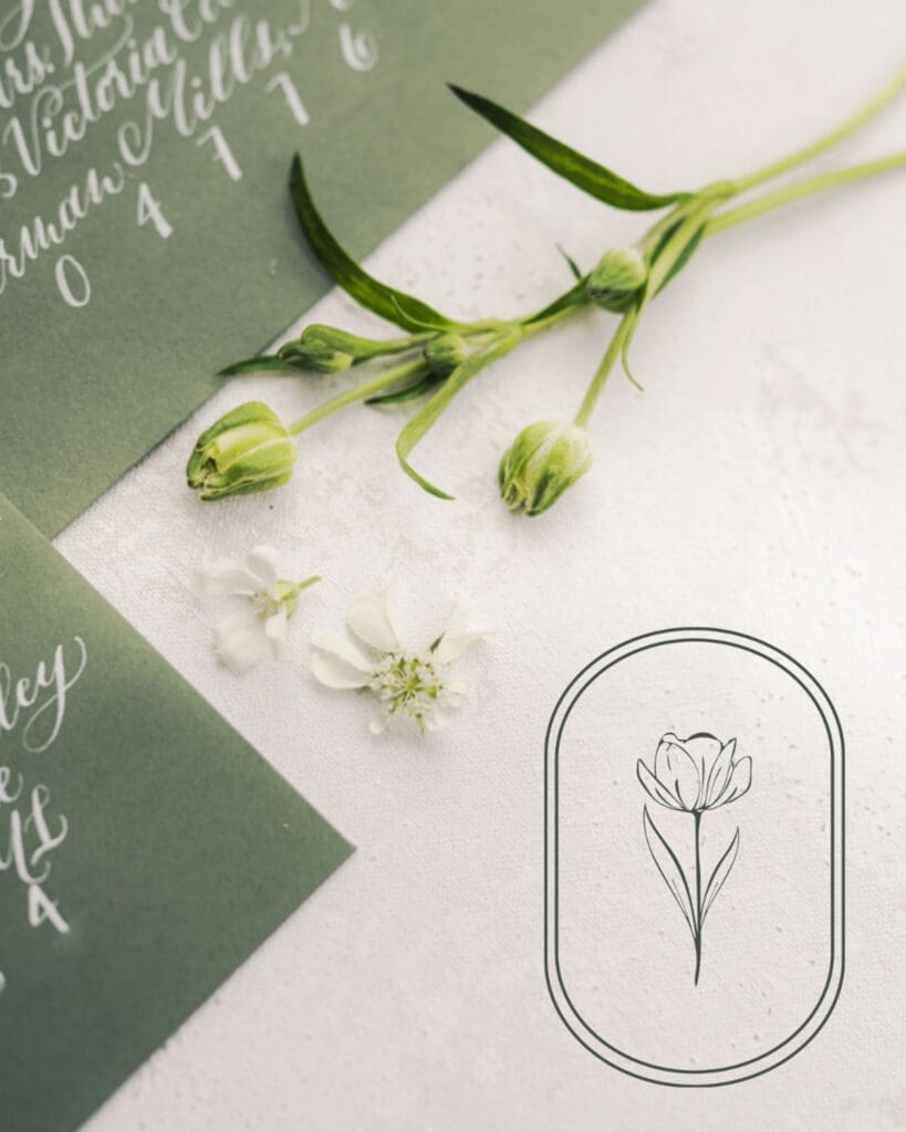
The Color Palette — Soft, Layered, and Full of Light
Color played an important role in shaping the emotional tone of this rebrand.
We leaned into soft, layered hues that feel airy, romantic, and painted; colors inspired by watercolor washes, delicate florals, heirloom paper, candlelight dinners, and the quiet beauty of meaningful moments.
The palette was intentionally designed to feel calming, joyful, and luxurious all at once.
Typography — Romance Meets Refinement
Typography became one of the most transformative parts of this project.
We paired romantic, expressive type with refined serif fonts to create a balance between artistry and sophistication. The result feels elevated yet approachable, capturing both the emotion and the intentionality behind our work.
Every detail was chosen to create an experience that feels beautiful from the very first impression.
What This Project Meant to Us
This rebrand was more than a visual refresh. It became an opportunity to reconnect with the heart of why we started Pretty Petal Papers in the first place.
It reminded us that beautiful design is not just about aesthetics. It is about creating connection, preserving emotion, and helping our clients celebrate the people they love most.
We’re incredibly proud of this new chapter because it feels deeply aligned with who we are today and the experience we want to continue creating for our clients – YOU – moving forward.
What to expect from Pretty Petal Papers going forward
While our look may feel more refined, our heart remains the same.
You can continue to expect bespoke stationery designed with intention, artistry, and care — pieces that feel deeply personal and thoughtfully crafted from beginning to end.
Moving forward, we’re excited to continue creating:
- Custom wedding stationery rooted in storytelling and emotion
- Joyful, artistic designs with a refined and timeless perspective
- A highly personalized experience for every client
- Paper goods that feel meaningful, tactile, and worthy of being kept forever
This new identity is simply a reflection of where we’ve always been headed — toward beauty, connection, and creating work that feels as meaningful as the moments it represents.
Thank you for being part of this next chapter with us. We cannot wait to share what’s ahead.
Looking for stationery that feels like an entire experience? Inquire here.


Be the first to comment